Incorporating user centred design practices within Agile product development can be a major challenge. Most of us in the user experience field are more familiar with the waterfall “big design up front” methodology. Project managers and developers are also likely to be more comfortable with a discreet UX design phase that is completed before development commences. But this approach tends to be inefficient, slower and more expensive. How does the role of the UX designer change within Agile product development, with its focus on transparency and rapid iteration?
While at Isotoma we’ve always followed our own flavour of Agile product development, UX is still mostly front-loaded in a “discovery” phase, as at most agencies. Our recent vision mixer (case study) project for BBC Research & Development, however, required a more integrated approach. The project had a very tight timeframe, requiring overlapping UX and development, with weekly show & tells.
From a UX perspective, it was a positive experience and I’m happy with the result. This post lists some of the techniques and approaches that I think helped integrate UX with Agile. Of course, every project and organisation is different, so there is definitely no one-size-fits-all approach, but hopefully there is something here you can use in your work.
Change is good
The greatest risk when integrating UX with agile development arises from the fact that, unlike ‘waterfall’ projects, the product design is not finalised before development gets underway. This is dangerous. On well-managed projects, we need to strictly manage scope. We want to avoid building things that may have to be redone, or removed. We want to avoid confusion over what is the correct, final specification.
From my perspective, however, it is just as important to avoid rushing the design process and discouraging design changes. We want to test the designs on users and feel free to act upon the learnings. For me, design changes during the course of a project are an indicator of success. Change means I am learning, I’m re-evaluating my assumptions, and the product is improving. But from a project management and development standpoint, design changes – especially once development is underway – are problematic.
Another risk is lack of continuous UX resource. For budgetary reasons, on most projects UX tends to be front-loaded in a “discovery” phase. This can mean UX input may be unavailable later in the project, adding to the pressure to finalise the design early on, and strongly dissuading changes later on. On this project, I was committed for the entire timeframe, although from mid-way my time was reduced to 3 and later 2 days per week.
Many of the approaches described below are ways of mitigating these risks.
Co-location, collaboration and whiteboards
For most of the project our team – UX, technical and project management – were all located within talking distance of each other in a single room. Whilst at Isotoma we’re avid Slack users, this definitely allowed us to work faster and more collaboratively, cutting out the friction of convening meetings and sharing visuals, helping me to get quick answers to questions. (At the same time it’s extremely important not to interrupt people’s focus, so this ability should not be overused.)
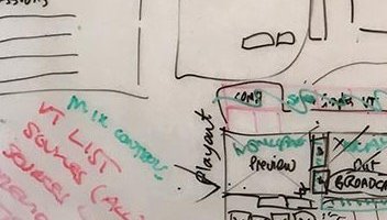
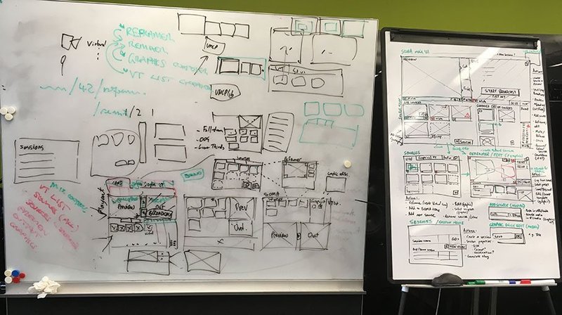
For the first couple of days the design evolved on whiteboards, with the whole team – UX and technical – taking part. We do not believe this stage of a project is the preserve of the so-called “creatives” – everyone has a valuable contribution to make, and everyone benefits from the shared understanding and buy-in this generates.
The whiteboards were the sole design spec at the start, but captured the overall scope of the application in a process that involved the developers. They included the major design decisions that allowed the team and the client stakeholders to visualise the product, and allow development to get underway. This gave me the time to work up detailed wireframes without holding up development.
Establishing a shared vocabulary
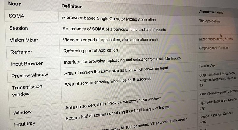
I started a draft controlled vocabulary right at the outset of the project. This defines all the meaningful nouns and verbs used in the application, and also which not to use. To allow it to be updated and shared easily, I used a wiki page on the BBC’s Confluence. The whole team – including client stakeholders – were notified of changes automatically. This project had in the region of 18 nouns and 7 verbs.
This helps in many, often unmeasurable ways. Obviously it help ensure the language in the user interface is consistent. But it is equally important that everyone working on the project uses the same language and mean the same things by it, avoiding costly misunderstandings.
Thinking in components
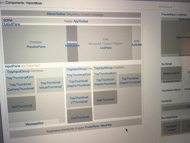
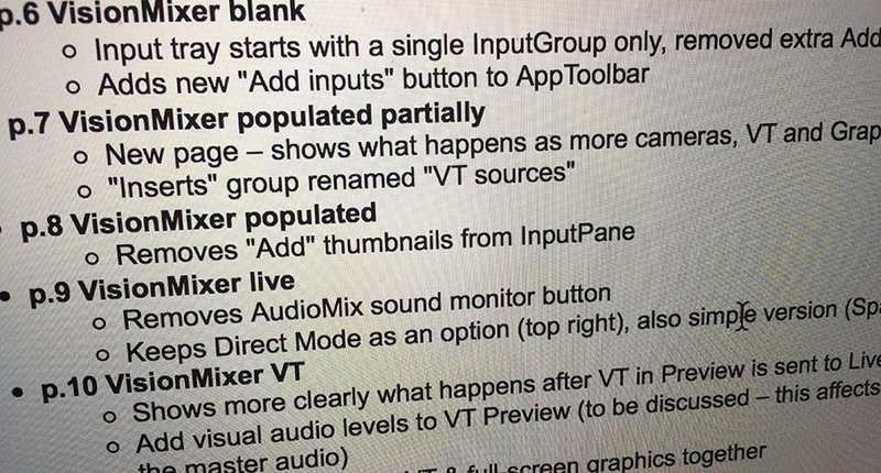
Staying with naming, we worked out the application’s component system early on. In the initial stages of wireframing, I worked with a developer to create “grey-box” diagrams identifying the distinct functional units and containers. Their contents and design didn’t matter at that stage: “We don’t know what these things will look like yet, but we know they’ll exist and what they’re for.”
We used an agreed CamelCase naming scheme, which was followed verbatim in the React, HTML and CSS code. (This is an evolution of a technique we’ve used for years, giving all pages and dialogue boxes and so on unique IDs.) This way the design specs and code all use the same names for things, making communication more effective and speeding up code development. (As many of the naming decisions get made early on.)
These early steps mean UX and development are both working productively right from the outset, avoiding a “mini-waterfall” effect where developers are waiting on UX deliverables, enabling us to give useful show & tells to stakeholders every week.
Versioning and change control
If the wireframes are in continuous evolution, diligent versioning and naming is essential. Other documents (such as user stories) that refer to the wireframes never use page numbers, which can change, instead relying on unique page and component names. I increment the wireframe version number whenever wireframes have been shared or discussed, making it easy to see exactly what someone was referring to at any point. Wireframes shared with the client get round-number versions, and these are all available via the Confluence wiki. Internally-shared wireframes use minor increments. The wireframe title page keeps a log of the wireframe versions, their dates and who they were shared with.
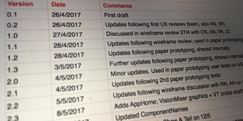
Later in the project, when the wireframes are largely complete, all new versions are accompanied by an email listing what had changed. We do not want to discourage changes, since changes mean improvements, but this helps ensure the inconvenience and potential confusion for developers is minimised, as they do not need to waste time reviewing the wireframes to see what had changed.
Lightweight user testing
There was no time to spend days setting up and reporting on user tests. I also wanted the UX process to be as transparent as possible. I ran 4 rounds of testing, taking no more than a day for each. The developers observed some of the tests, helping them to visualise the product in use. In our weekly show & tell sessions I could recap the main findings and any resultant changes to stakeholders. I wrote more about this in my post on rapid user research.
Cutting out design
What do I mean “cutting out design”? Even ostensibly “design-free” wireframes already include important design decisions in layout and information hierarchy. Nevertheless, they usually stick to a boxy, greyscale “wireframe aesthetic” and don’t specify exact measurements, font sizes and colours, leaving that to a later phase and often a different designer, adding significant time. There was no such phase on this project.
This illustrates the benefits of a well documented design system and pattern library. I was able to apply the BBC’s excellent GEL guidelines at the wireframing stage, adding very little additional time to normal wireframes, and still getting a professional looking, on-brand result – suitable for an internal R&D tool such as SOMA anyway. Further visual refinement was done, as I prefer, in the browser, using CSS – see next section.
Wireframes to HTML
This may be controversial, and is not something all teams will necessarily be willing to do. (Nor will it be an option in most cases.) As on many of our projects, once the wireframes were largely completed, I switched to front-end development, creating static HTML mockups and CSS that were then used as the basis for the React application.
This has many advantages, especially on a project with such a tight timescale:
- Because I had already been thinking of the design in terms of informational hierarchy and functional components, I was the person best placed to translate this into the most logical HTML structure. The component naming scheme directly mapped to class names.
- Visual design is best finalised directly in the browser – allowing me to make design decisions based on how the layout adapts to different screen sizes and amounts of content. Working in CSS at this stage is far more efficient than traditional design tools.
- The HTML mockups allowed me to run user tests with an interactive prototype in the browser far sooner than would’ve been possible with the production app.
- Even though my role (and day rate) had changed to that of front-end development, I was still available in a design capacity, enabling me to make improvements in response to user test findings or new information, into the later stages of the project. (Prioritising carefully to avoid tripping up developers.)
There are also downsides to sharing UX and front-end development duties, which I’ll return to in a later post.
Learnings (TL;DR)
To recap, these are the things I think helped to successfully integrate UX within an Agile project:
- Co-location, collaboration and whiteboards – avoiding “big design up front in isolation”.
- Establishing a shared vocabulary – ensuring everyone speaks the same language.
- Thinking in components – working with a developer to “componentise” wireframes from the outset.
- Versioning and change control – because design specifications are in flux, ensure people refer to the latest version and clearly communicate all changes.
- Lightweight user testing – quick, frequent tests, with findings communicated verbally and plowed directly into design
- Cutting out design – using the style guide and pattern library whilst wireframing, and refining design in the browser.
- Wireframes to HTML – having the same person doing UX and HTML/CSS creates efficiencies and retains UX expertise throughout the project.
